Building a Design Language for the Cloud
From early visual exploration to a comprehensive design system, this work established a cohesive language for how IO communicates, operates, and visualizes complex systems.

IO Data Centers was at a turning point. Originally built around colocation infrastructure, the company was expanding into cloud services and proprietary data center technologies, aiming to reposition itself as a modern, technology-led platform.
The challenge was not just to update how IO looked, but to redefine how it communicated and operated across the business. Product, marketing, and engineering were evolving in parallel, without a shared language to unify them.
This created an opportunity to use design as a connective layer. The work focused on building a cohesive system that could translate complex infrastructure into clear, consistent experiences across software, marketing, and physical environments, while elevating IO’s position in a highly competitive, enterprise market.
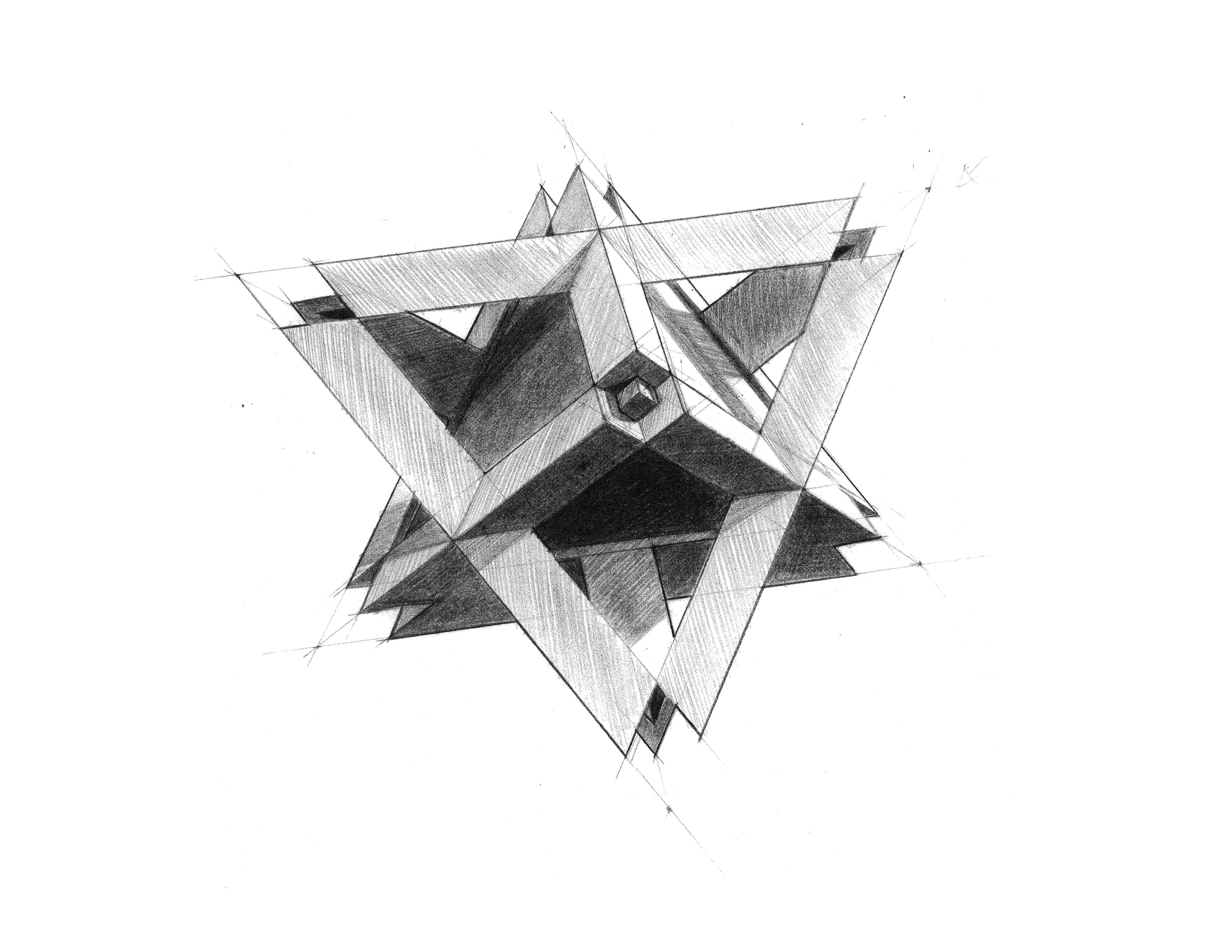
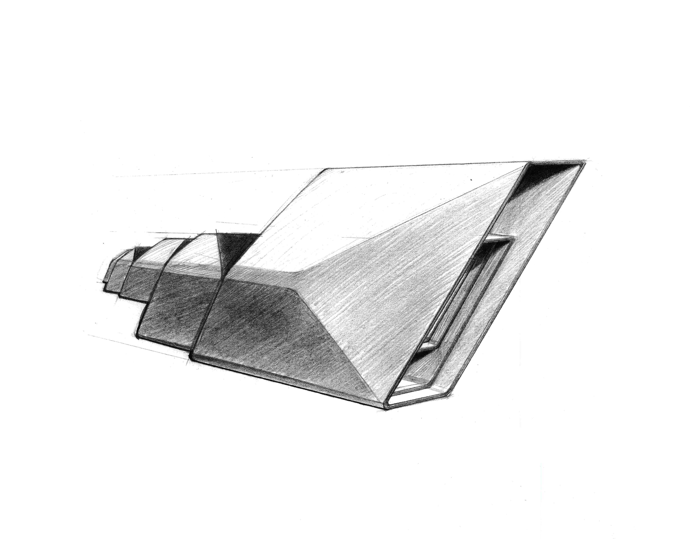
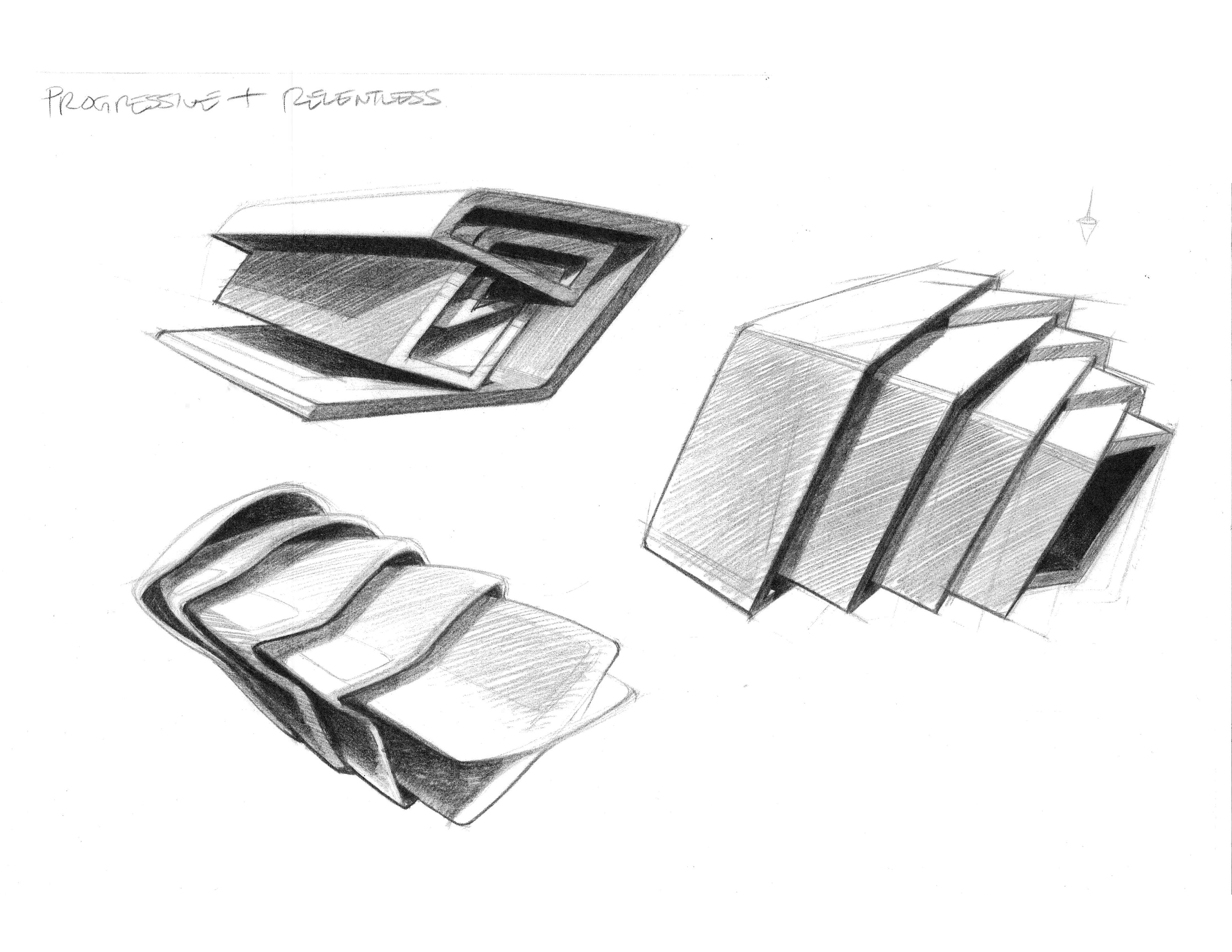
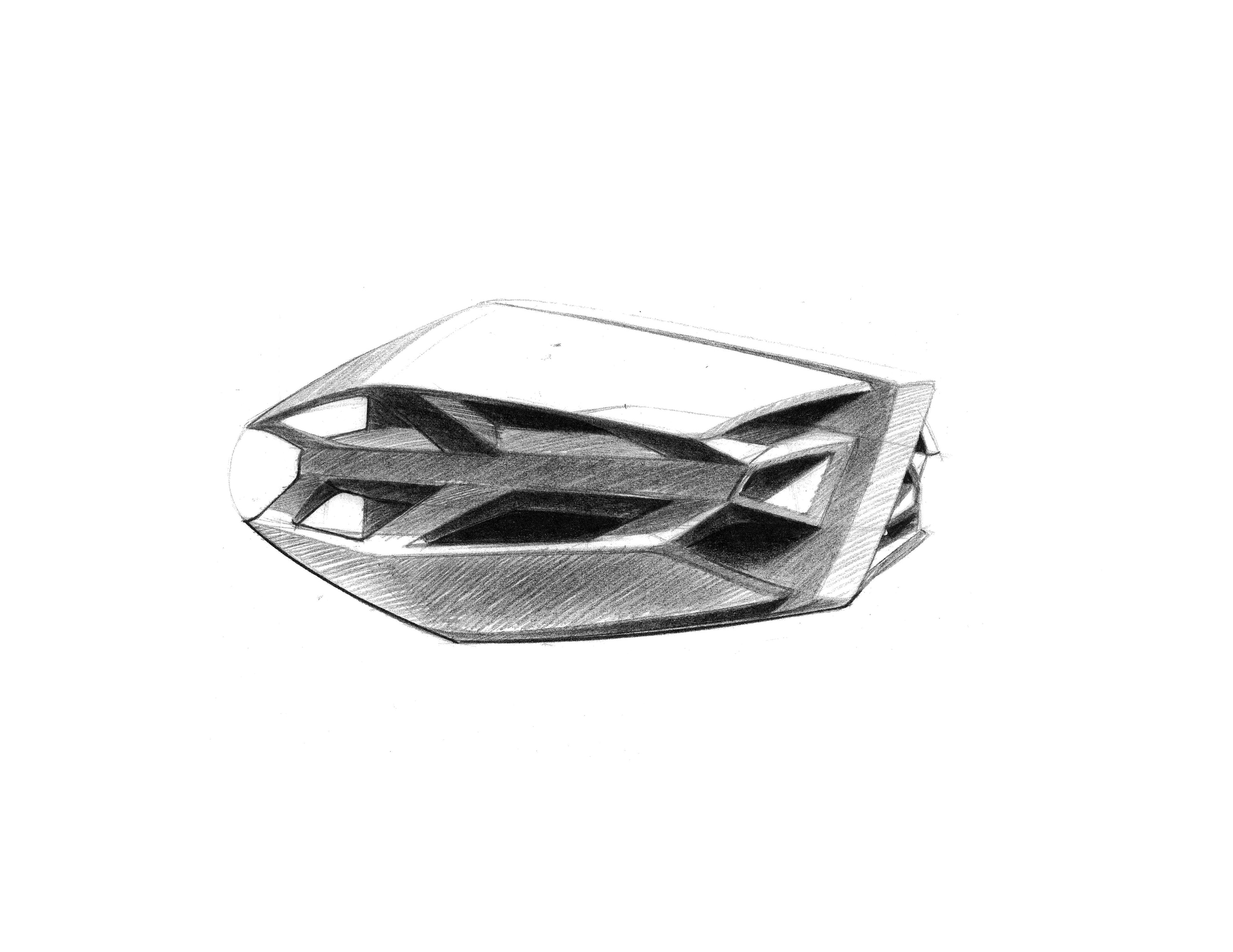
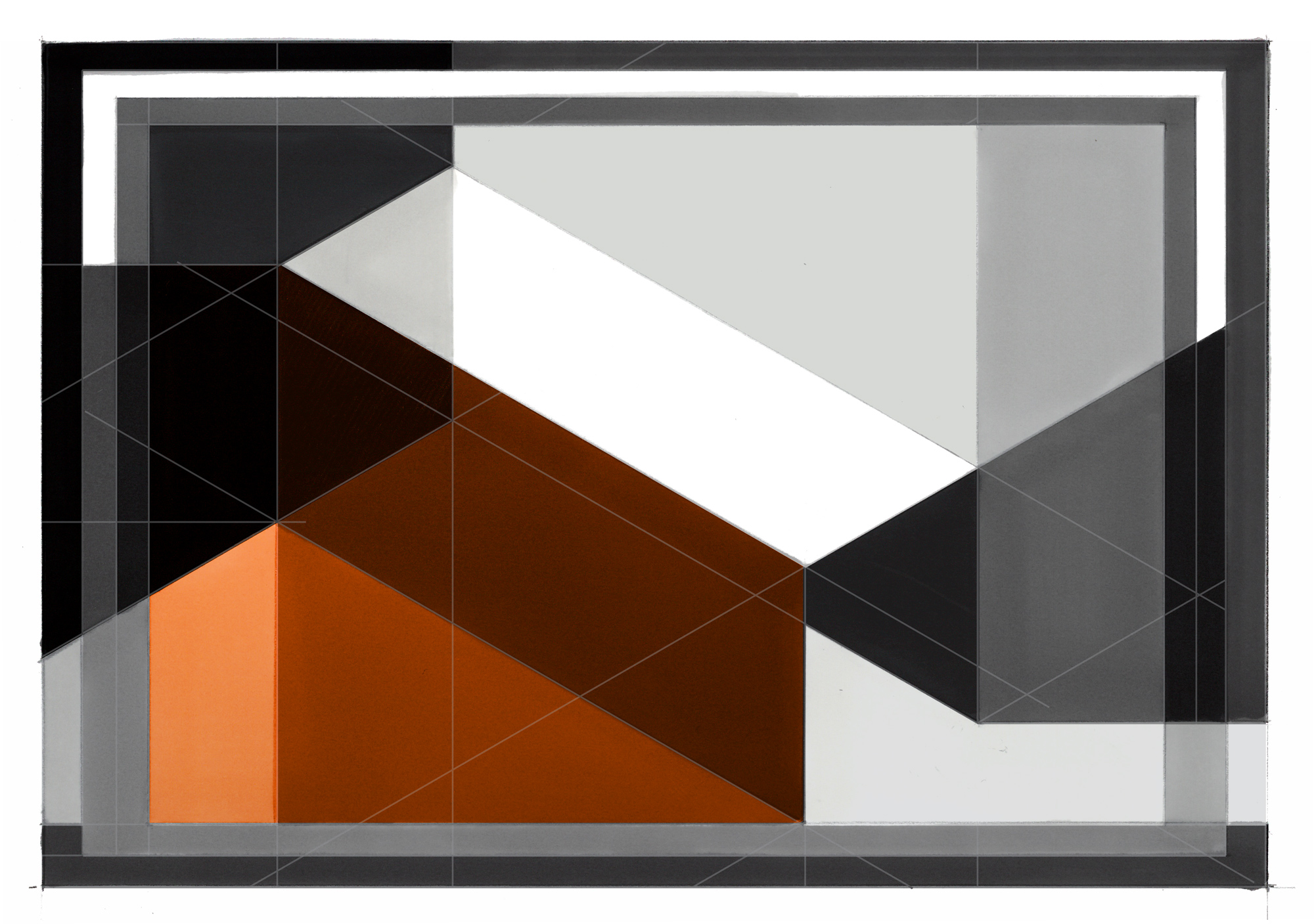
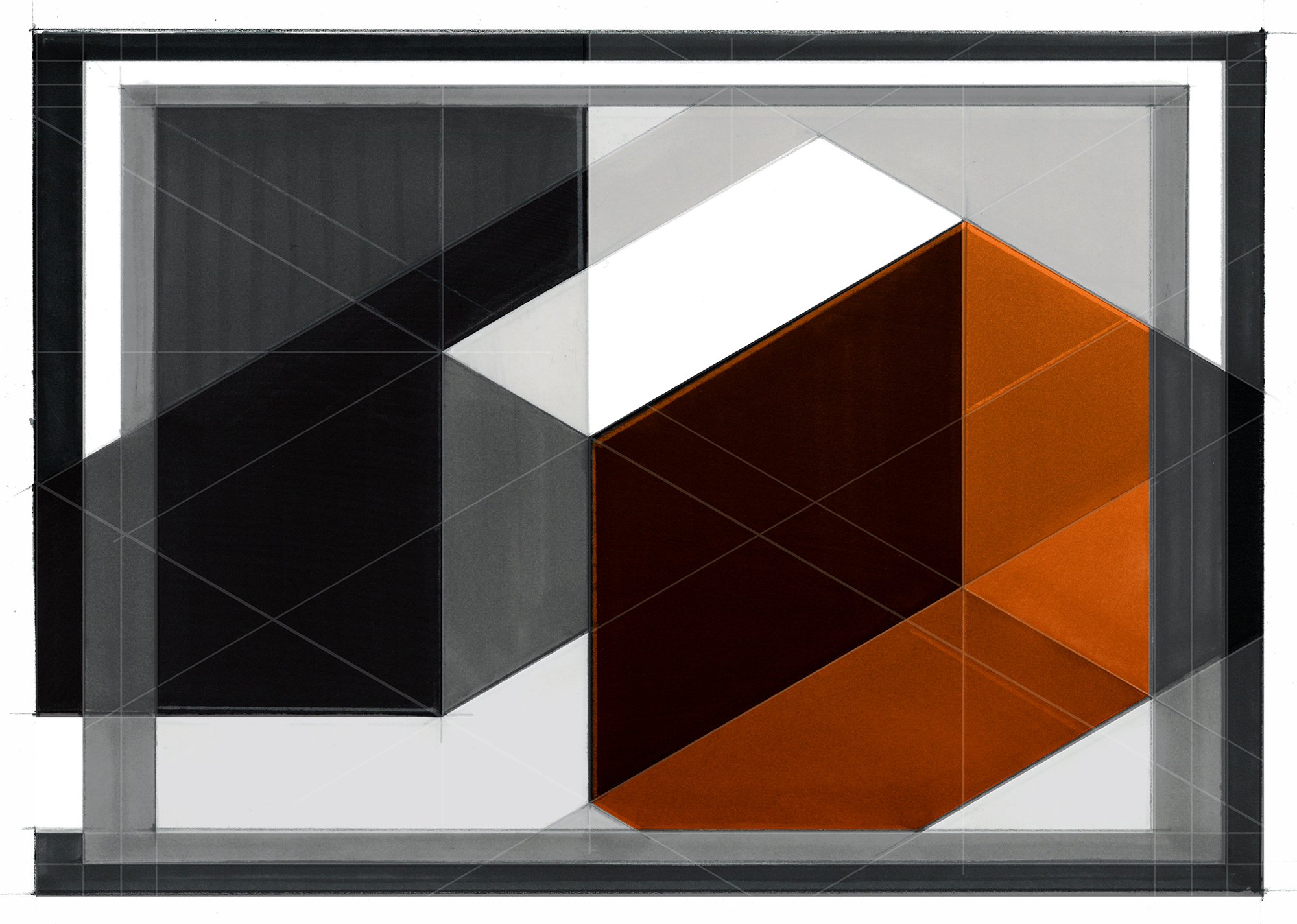
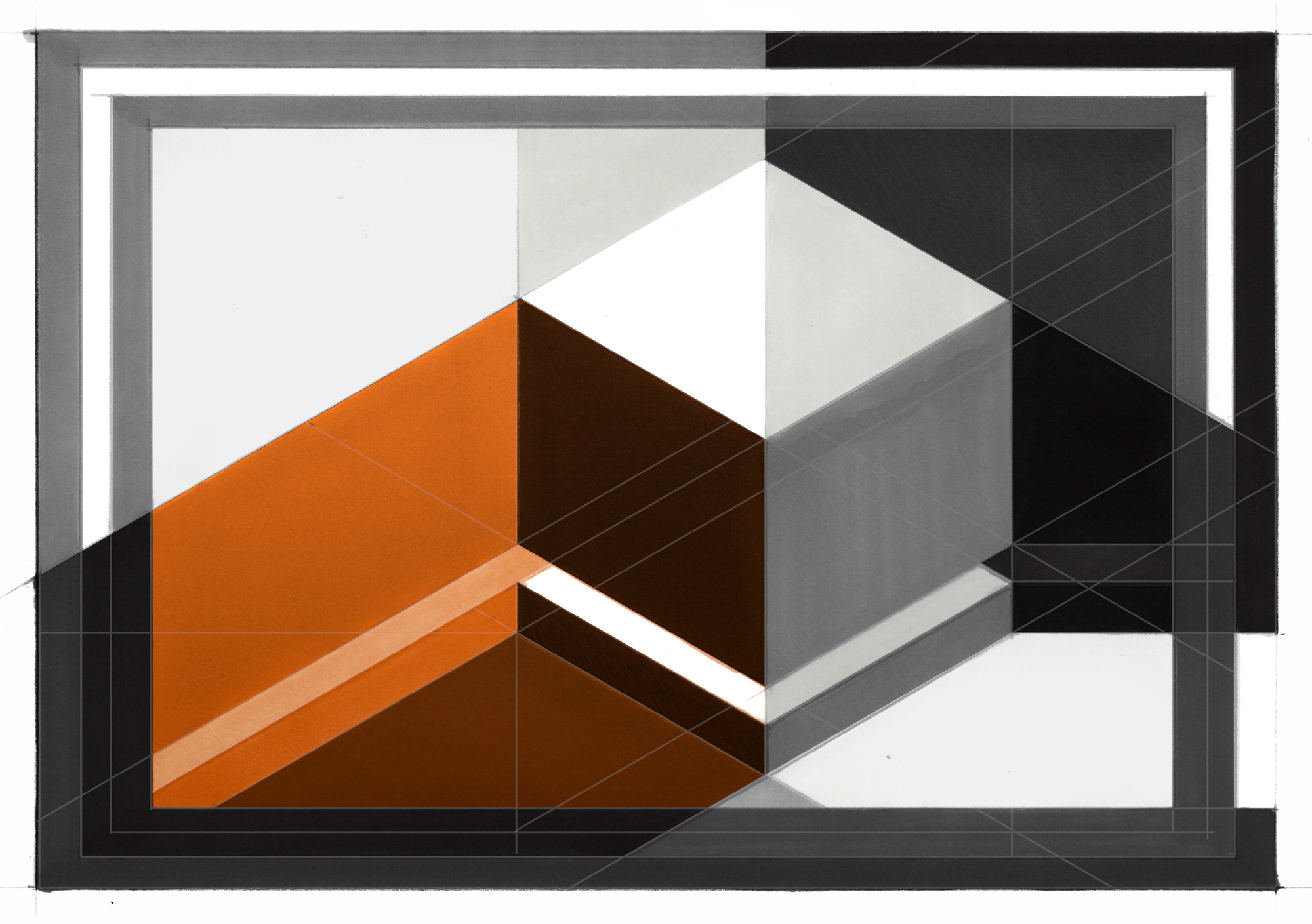
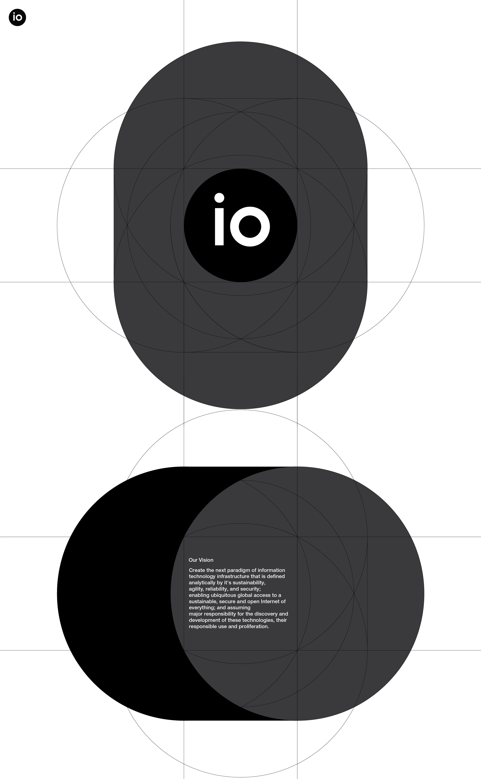
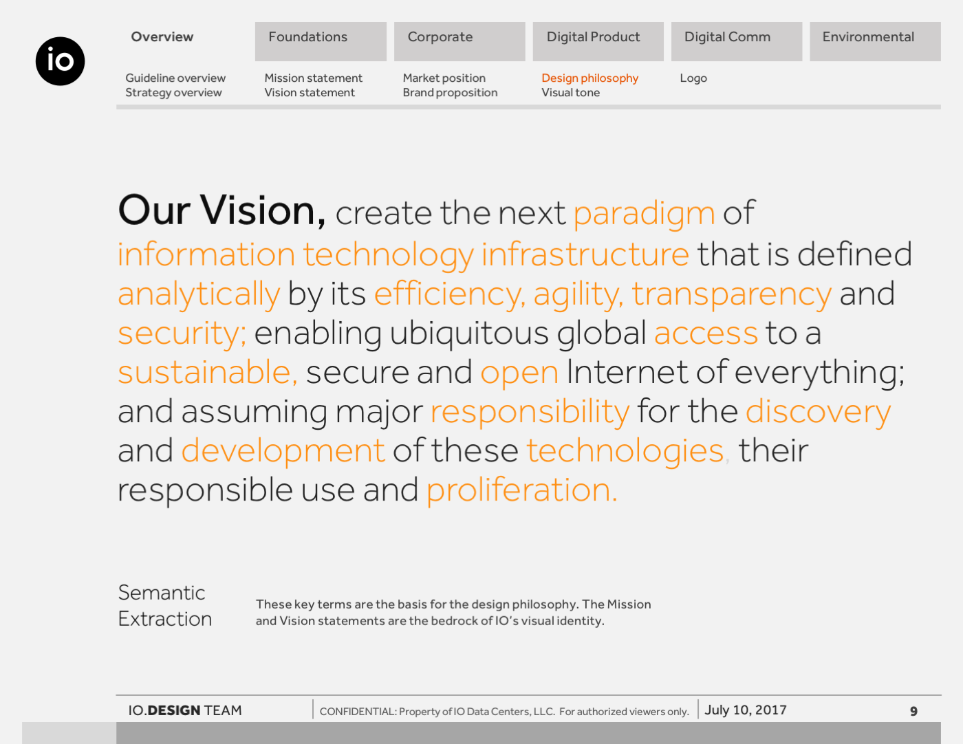
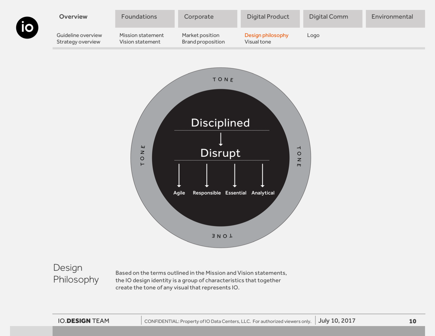
The visual exploration turned IO’s mission and vision statements into a visual language through a series of conceptual form studies. Each direction: Relentless, Progressive, Optimal, and Integrity, was expressed through geometry, structure, and motion, establishing a foundation for how the company would communicate across product, interface, and marketing.
While not all forms were realized physically, the underlying principles informed the design system, UI patterns, and overall brand expression.
As IO evolved into a technology-led data center provider, the organization embraced a more modern, design-forward mindset, treating design not just as communication, but as a core part of its identity.
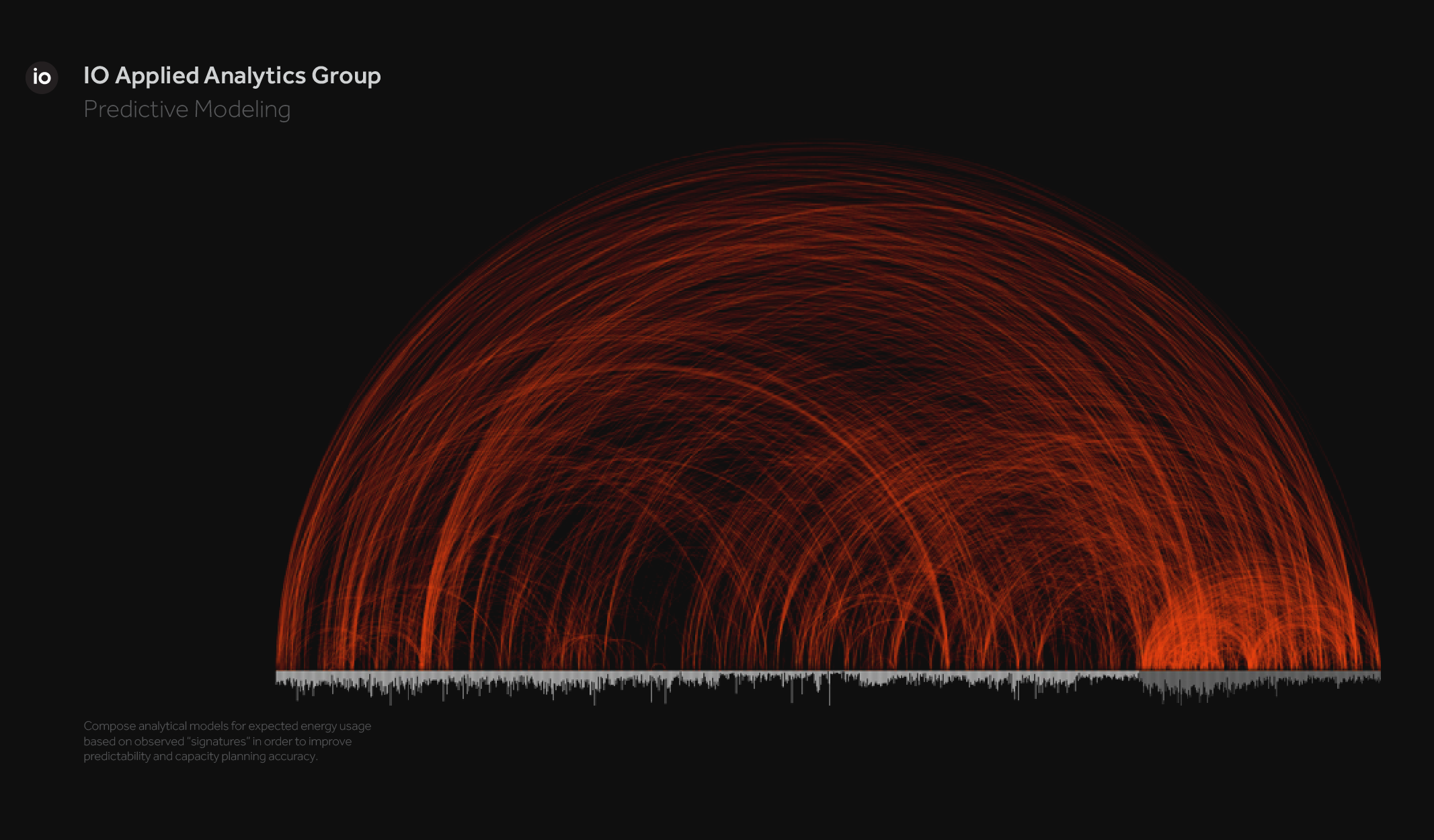
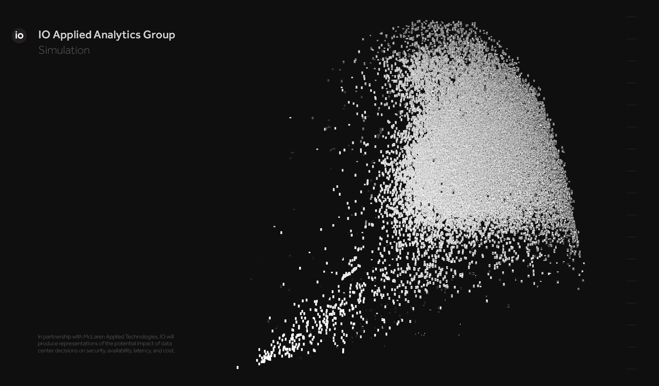
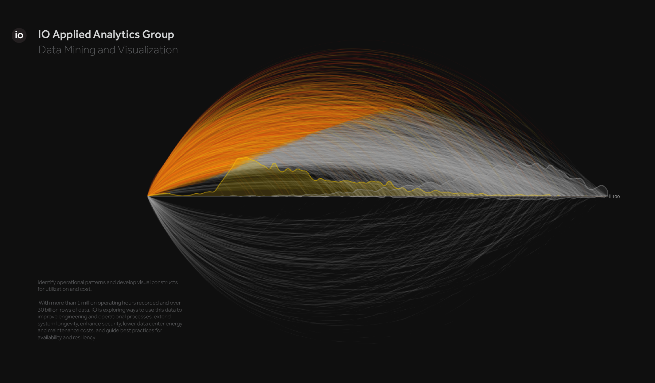
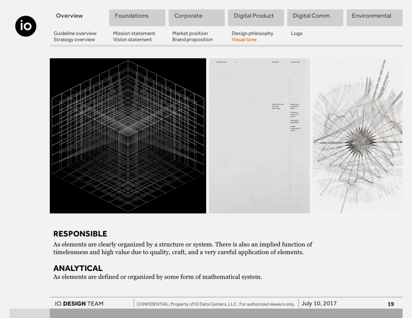
During this period, a series of visual explorations interpreted large-scale datasets, operational behaviors, and system performance through generative and analytical compositions. These studies translated complex, often invisible systems into structured and expressive visual forms, revealing patterns, variability, and relationships in engaging ways.
Many of these compositions extended beyond digital use, becoming physical artifacts within the workplace. They reinforced a shared design language and signaled a cultural commitment to clarity, precision, and modern form.
This body of work informed both marketing and product experiences, establishing a cohesive visual foundation that bridged technical depth with accessible, human-centered communication.
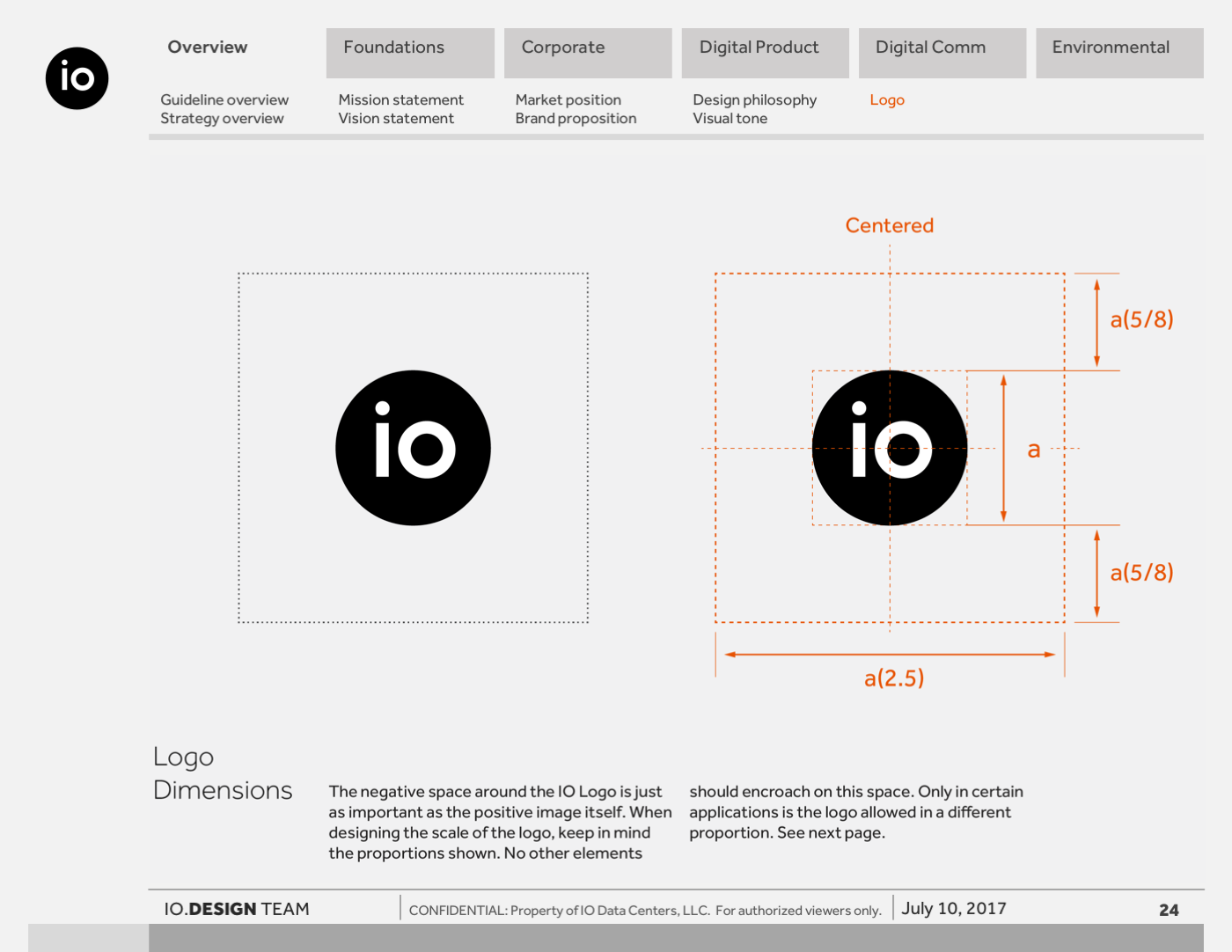
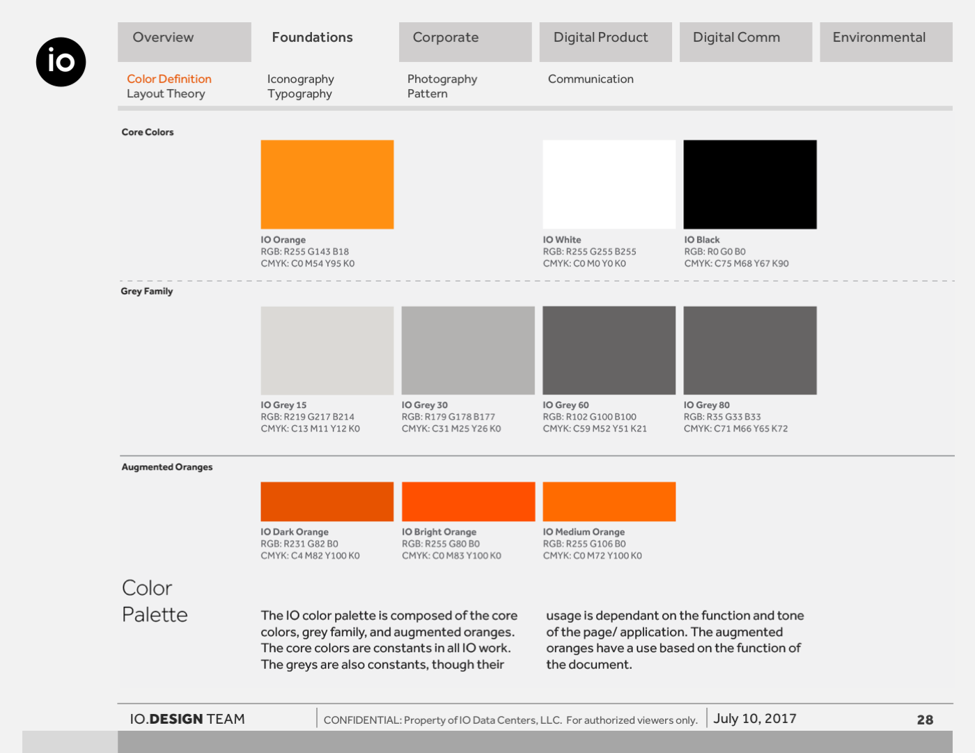
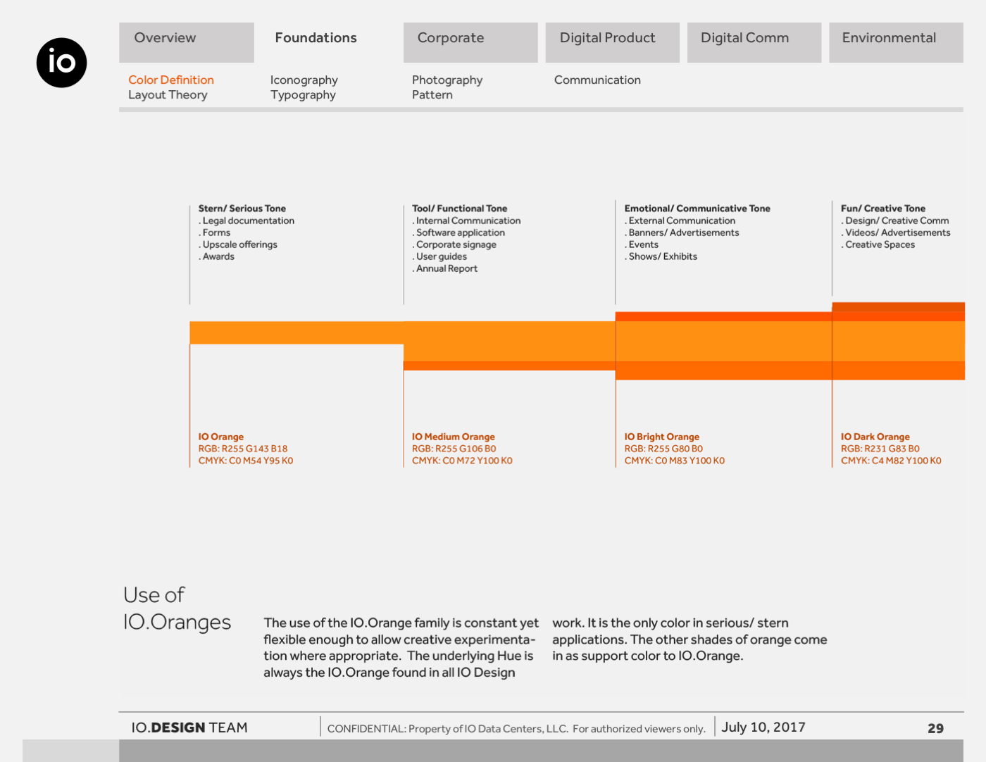
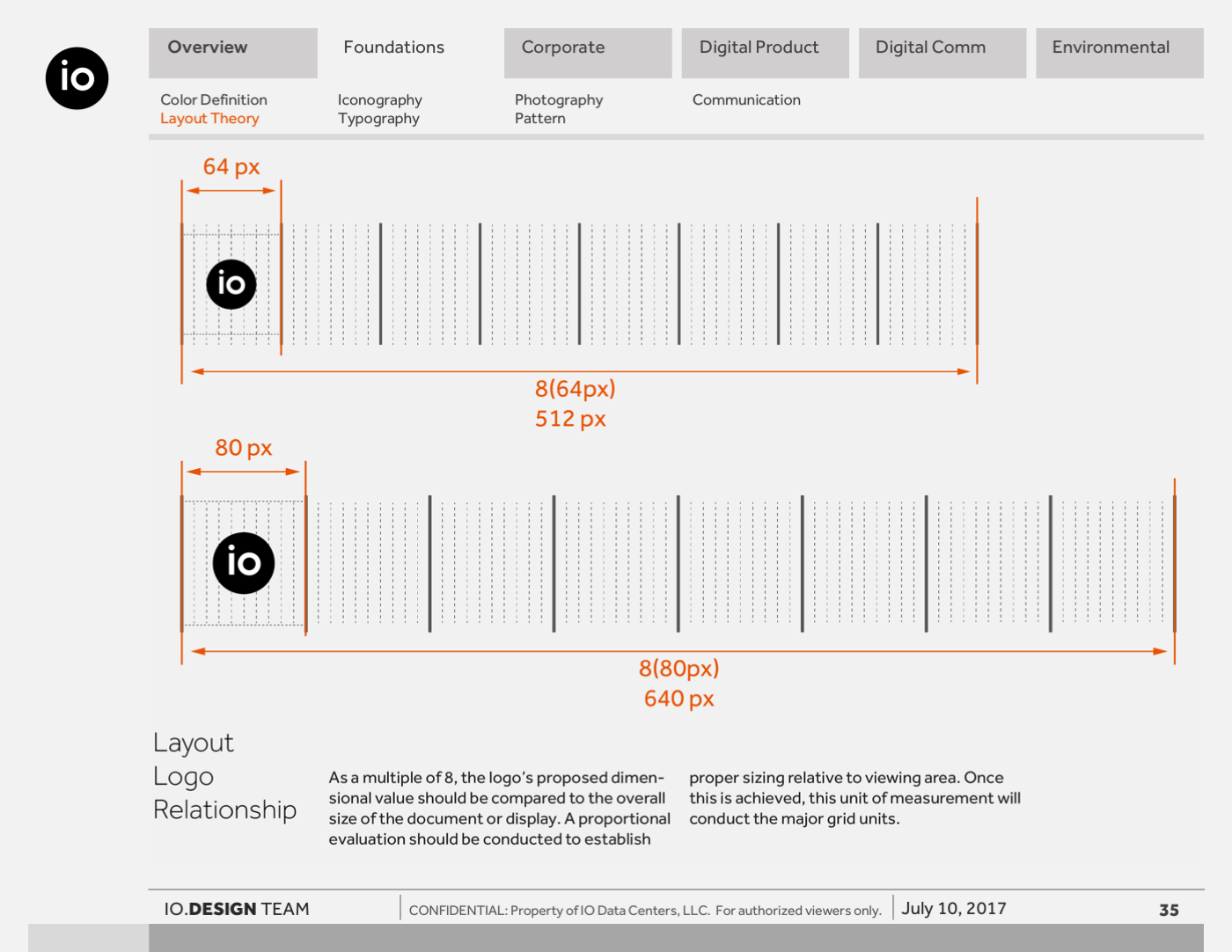
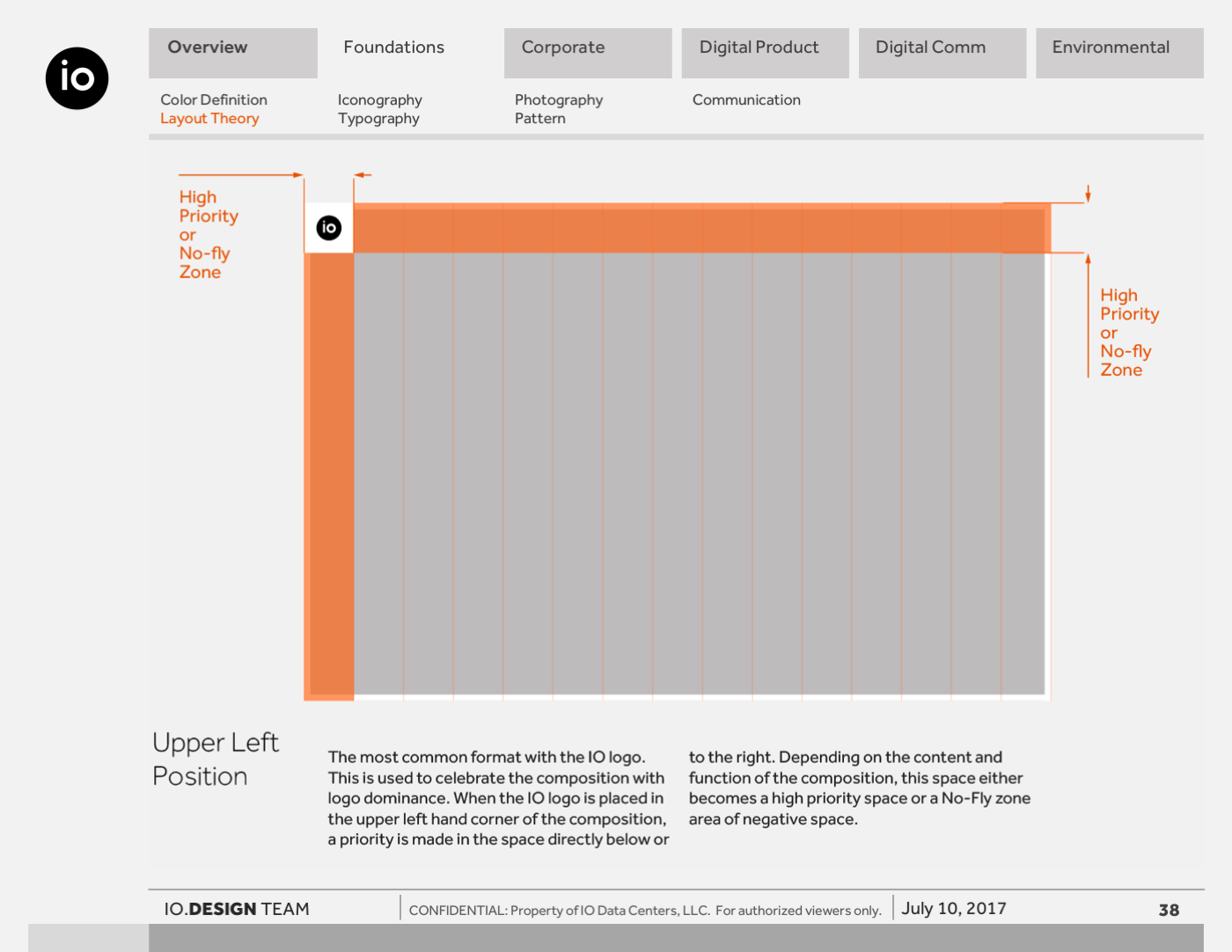
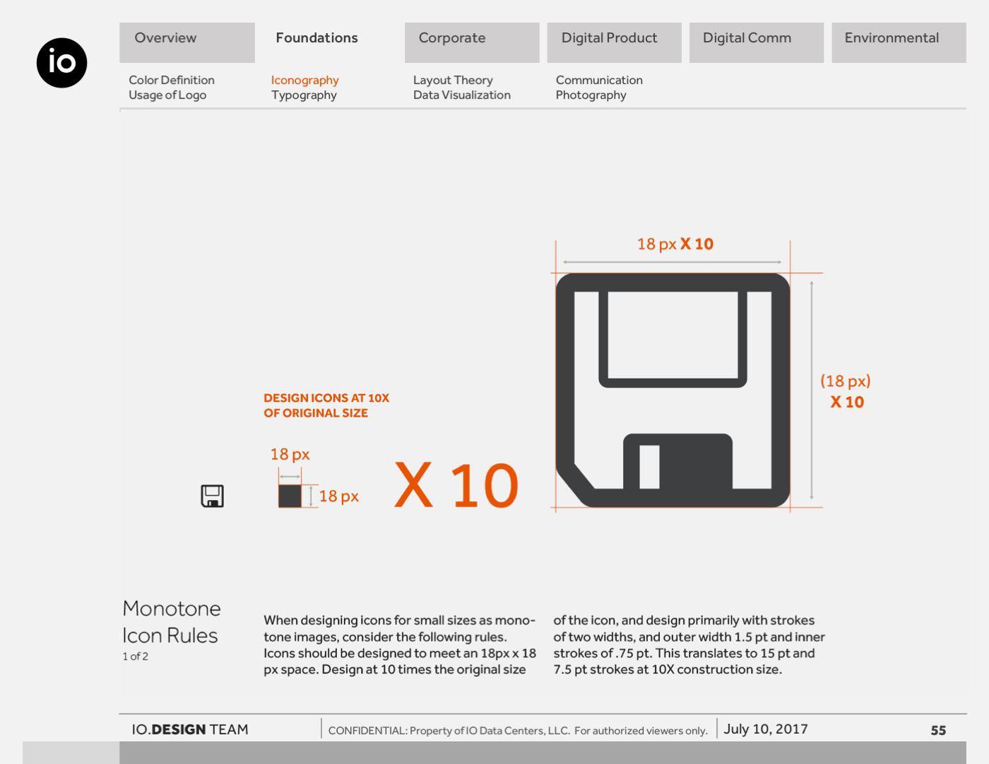
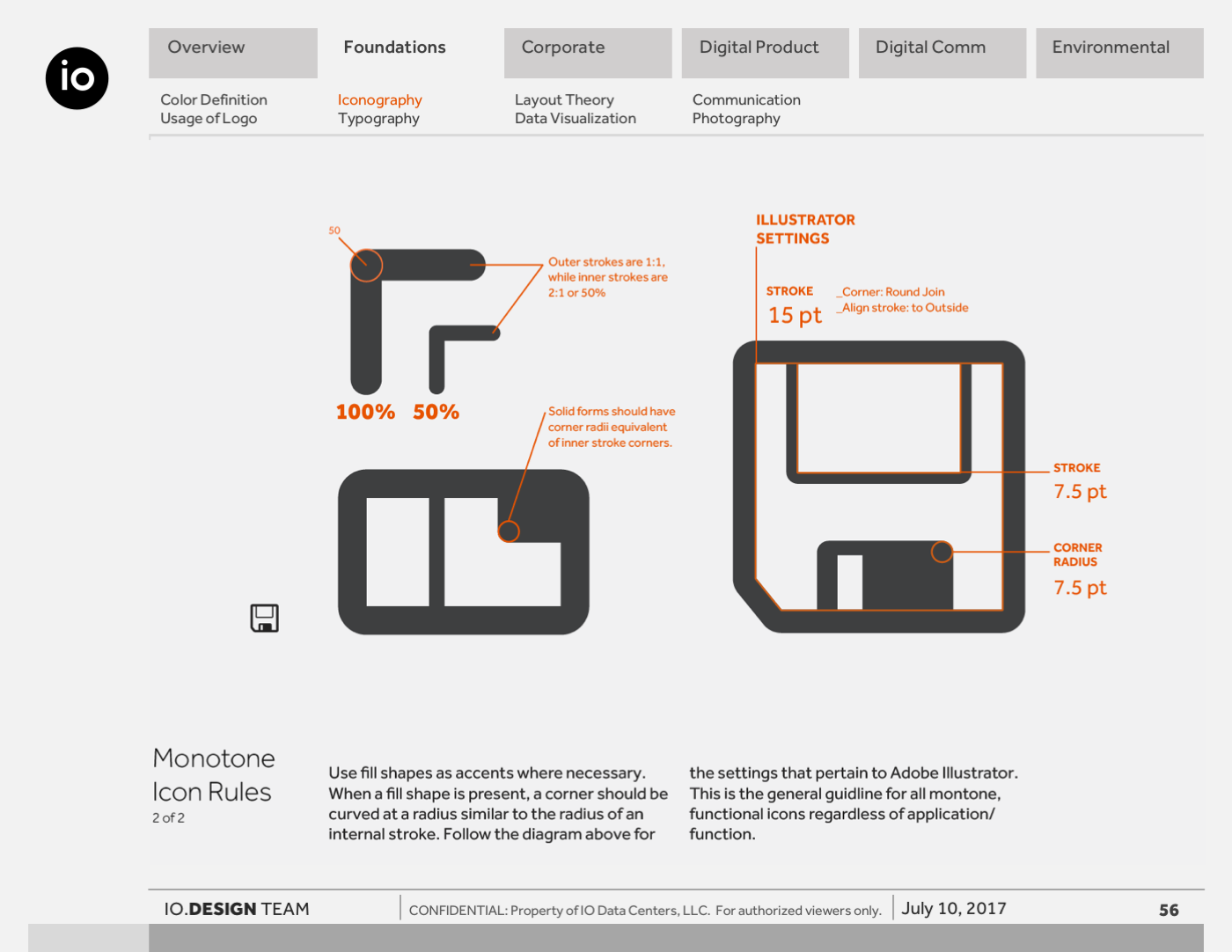
Following an extensive period of identity exploration, the IO design language was formalized into a comprehensive styleguide. Earlier visual studies, including generative data compositions and form-driven sketches, established the core principles of clarity, structure, and precision. This phase translated those principles into a scalable system.
The styleguide defined typography, color, grid logic, iconography, and layout behavior across both digital and physical environments.
It ensured consistency across marketing, product interfaces, and environmental applications while remaining flexible enough to support evolving needs.
More than a set of rules, the system codified a design mindset. It connected exploratory work to real-world implementation and aligned teams around a shared visual language that made complex infrastructure feel clear, legible, and intentional.
Project Title
Lorem ipsum dolor sit amet, consectetur adipiscing elit. Suspendisse varius enim in eros elementum tristique.
Project Title
Lorem ipsum dolor sit amet, consectetur adipiscing elit. Suspendisse varius enim in eros elementum tristique.